
A venue website has one job, which is turning a curious planner into an inquiry with enough detail to respond to. Most venue sites are built to look good instead. They open with a slideshow, bury capacity on a page called About, and end in a contact form that asks for twelve fields before it lets anyone hit send.
Planners rarely complain about any of that. They simply leave and inquire somewhere that made it easier, and you never see the lost lead.
What Does an Event Venue Website Need to Convert Inquiries?
An event venue website needs a homepage that shows who the venue is for and what a real event looks like, a page for each space with capacity by layout and photos, clear pricing signals, pages for your main event types, social proof from real events, and a short inquiry form that asks for date, guest count and event type. It must also load fast on a phone.
What Planners Need to See on the Homepage
Within a few seconds, a planner should know what kind of events you host, roughly how many guests you hold and where you are. Everything else on the homepage supports those three answers.
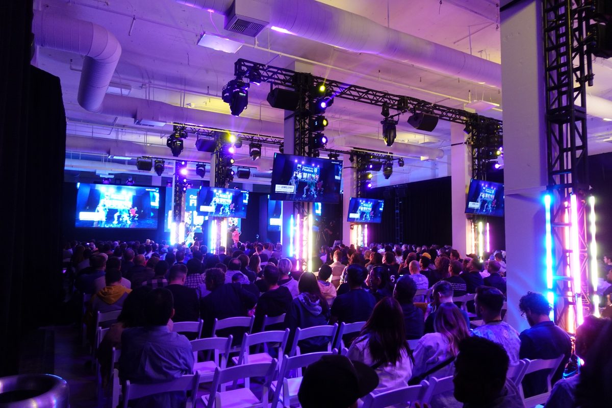
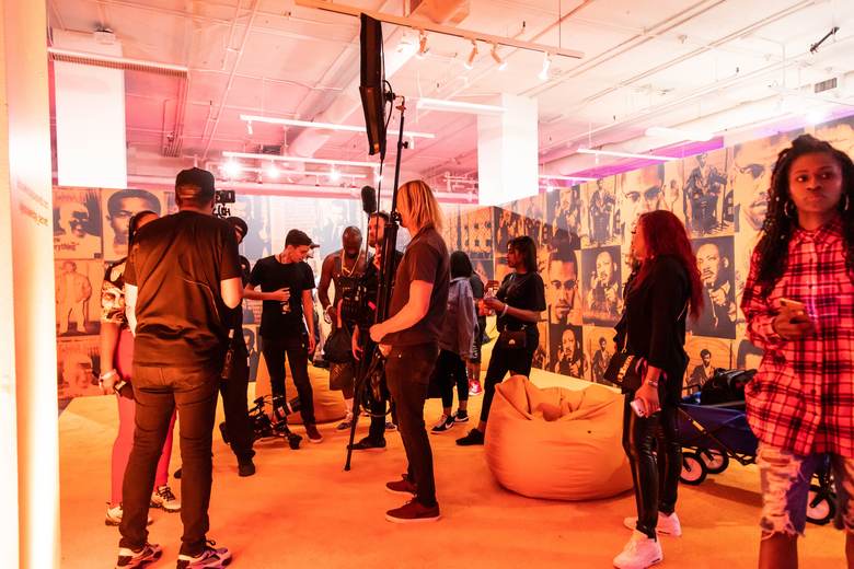
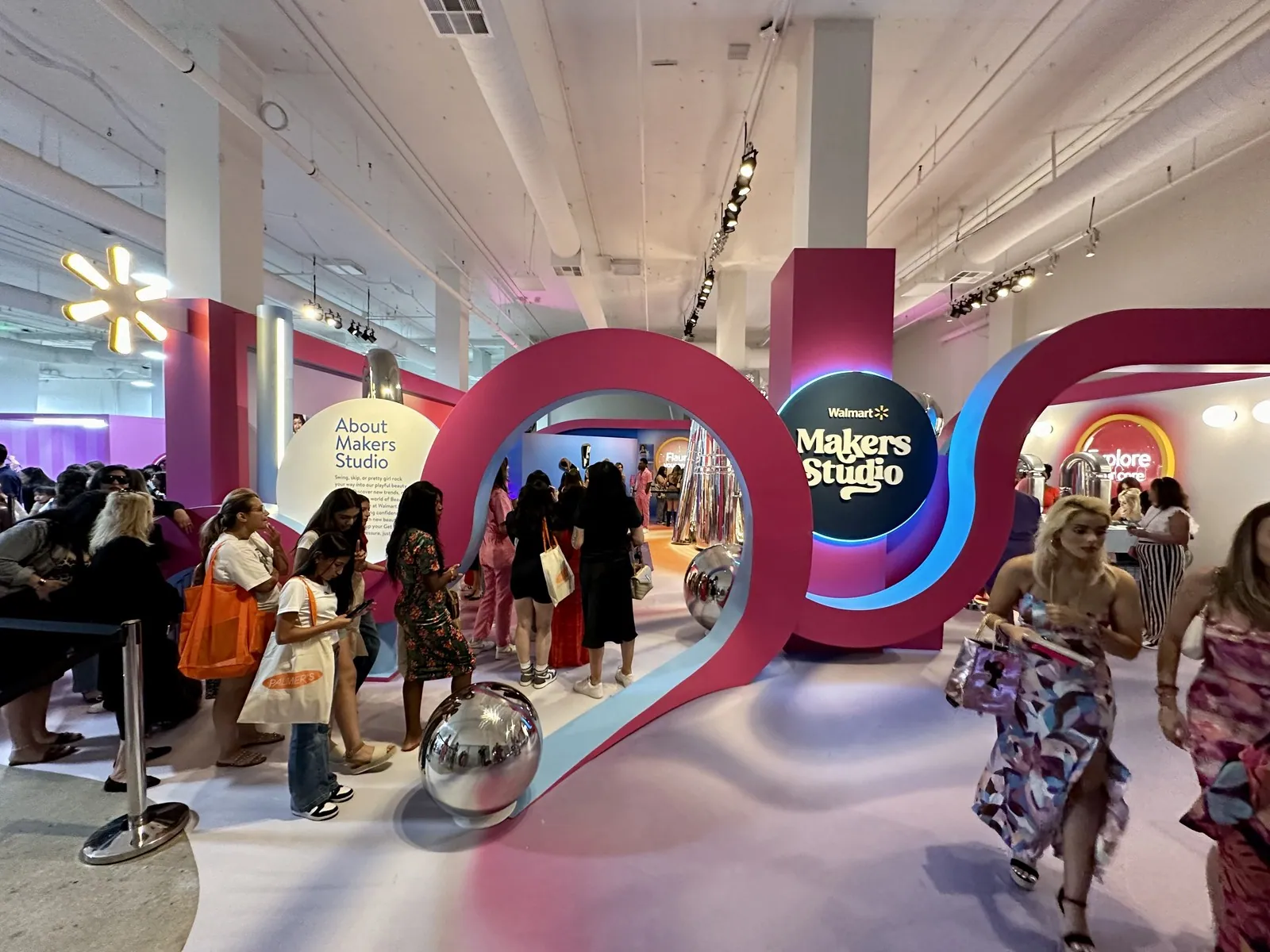
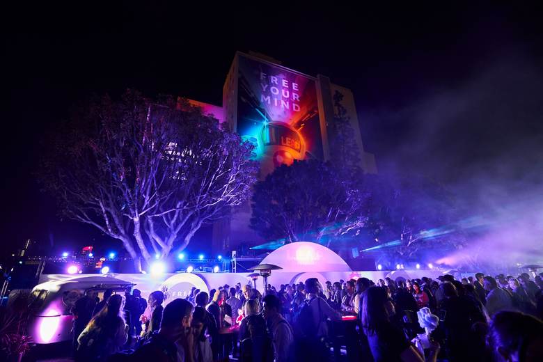
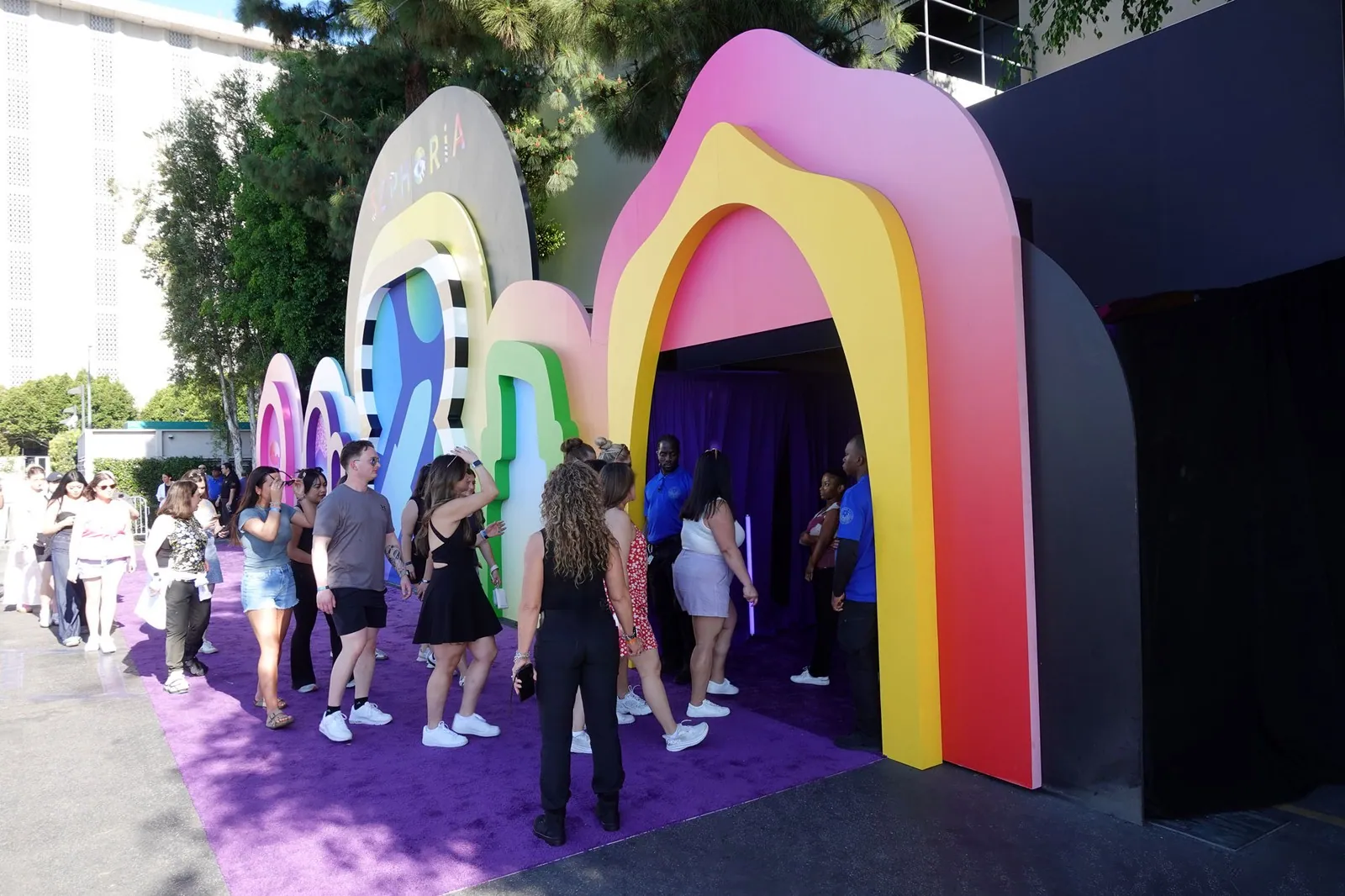
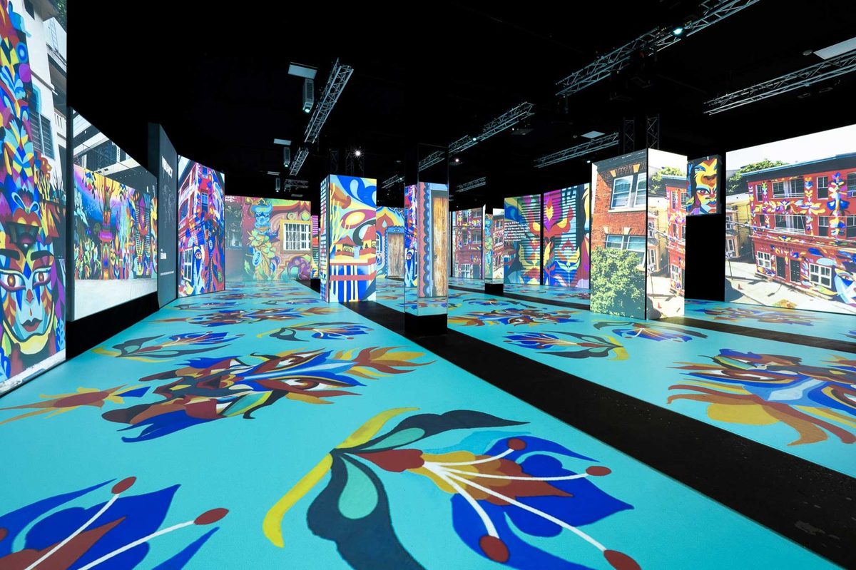
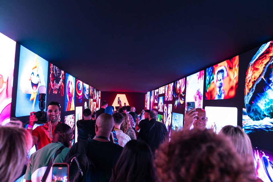
- A hero photo of a real event in full swing
- One line naming your event types and guest range
- Your neighborhood or city, visible without scrolling
- An inquiry button that stays visible as visitors scroll
- Logos, reviews or event counts that show real demand
A slideshow that rotates through empty rooms is the most common homepage mistake. One strong event photo and a clear sentence do more work.
Pages for Each Space and Each Event Type
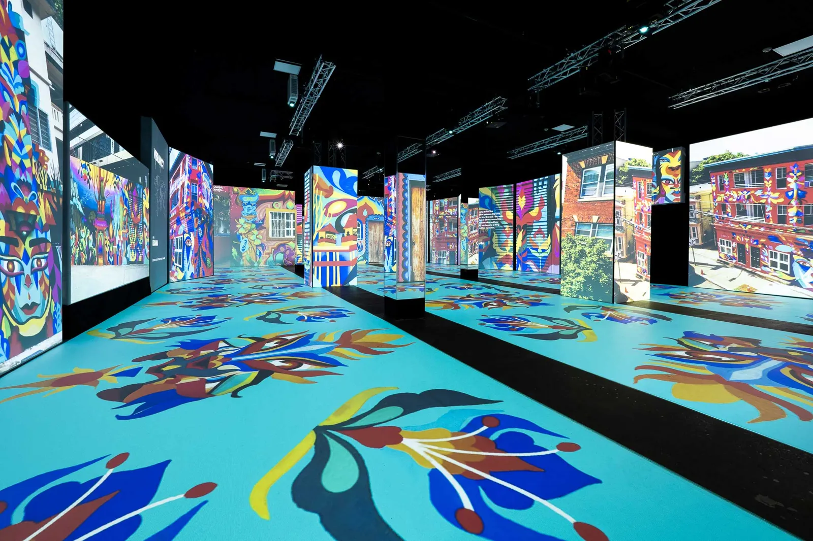
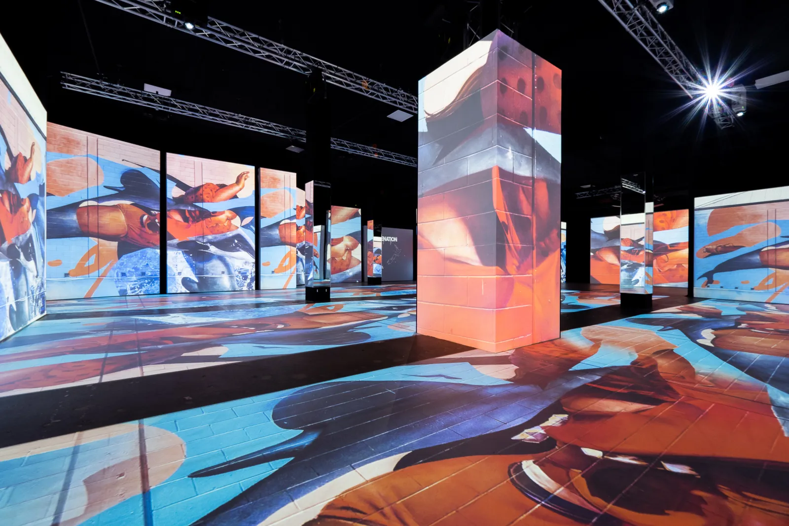
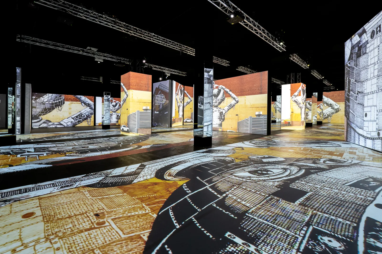
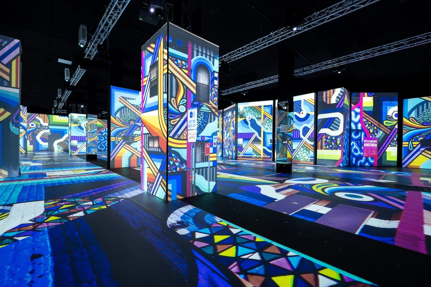
Give every bookable space its own page. Each one should show square footage, ceiling height, capacity for seated dinner, theater and reception layouts, a floor plan and six to ten photos, including at least one of the empty room so planners can picture their own design.
Then build a page for each event type you want more of, such as corporate events, conferences, weddings, nonprofit galas, brand activations or film shoots. These pages match how planners search and let you show the right photos, packages and inclusions for each audience. A corporate page that leads with AV, Wi-Fi and breakout rooms will outperform a general events page for that planner every time.
Pricing Signals and Proof
Planners want a sense of price before they spend time on an inquiry. You don't need a full rate card online. A starting price, a package range or a weekday versus weekend range helps planners self-qualify, and the inquiries you receive are more likely to fit your budget range.
Proof matters just as much. Show recent events with short descriptions of the event type and guest count, include reviews from your listing profiles, and name recognizable clients when you have permission. If you host a lot of one event type, a short gallery for each type shows planners you have done it before.
The Inquiry Form That Gets Completed
The inquiry form is where most venue websites lose people. Every extra required field cuts the share of visitors who finish, so ask only for what you need to send a useful first reply.
- Name, email and phone
- Event date or month, with a flexible-date option
- Estimated guest count
- Event type from a short dropdown
- An optional notes field
Confirm the submission on screen with when they will hear back, and send an automatic email that sets the same expectation. Then make sure a real person replies within the hour during business hours, since the form only works if the response is fast.
Place the inquiry button on every page, not just a contact page. Planners decide to reach out while looking at a space or a gallery, and the button should be right there when they do.
Speed, Mobile and Basic Trust
Many venue site visits now happen on a phone, often from a social post or a map search. Test your site on your own phone over a cellular connection. If the homepage takes more than about three seconds to show the main photo, compress your images before adding anything else.
Check that your address, phone number and hours match your Google Business Profile and listing sites. Add basic accessibility details, parking and transit directions. These small details answer questions that would otherwise go unasked and unbooked.
Run the Website Audit This Week
Pull the last 90 days of your website analytics and divide inquiries by total visits. Many venue sites convert somewhere around 1 to 3 percent of visits into inquiries. Moving from 1 to 2 percent on 2,000 monthly visits doubles your inquiries from 20 to 40 without spending another dollar on traffic.
Then walk through your own site as a planner would on a phone, from homepage to submitted inquiry, and time it. Fix the slowest step first. A website that makes inquiring easy is the cheapest marketing a venue owns.
Frequently Asked Questions
What is a good conversion rate for an event venue website?
Many venue websites convert roughly 1 to 3 percent of visits into inquiries, and well-built sites with strong photos, clear capacity and a short form can do better. Measure inquiries divided by total visits over at least 90 days, since seasonality and one-off traffic spikes can make a single month misleading.
Should an event venue website show prices?
Most venues benefit from showing at least a starting price or a range by event type or day of the week. It helps planners self-qualify and reduces time spent on inquiries that were never a fit. Detailed quotes can still be tailored after the inquiry, since final pricing depends on date, layout and services.
Should a venue website have online booking or real-time availability?
Real-time availability works well for simple, short rentals like meeting rooms or studio hours. For larger events, most venues get better results from a short inquiry form followed by a fast personal reply, because pricing, layout and services need a conversation. Some venues show a general availability calendar to signal which dates are open.
How many photos should an event venue website have?
Aim for six to ten photos per space page plus a gallery of real events by type. Include wide shots that show scale, styled setups for each event type, empty room shots and detail images. Fewer strong photos beat many weak ones, and every image should be compressed so pages still load quickly on a phone.